
Step into the world of Anne Frank through the captivating designs and symbolism of her diary’s book cover. The iconic image of Anne’s poignant gaze has become a powerful symbol of hope, resilience, and the indomitable human spirit. In this article, we delve into the artistry behind the creation of the book cover, exploring how it captures the essence of Anne Frank’s spirit. Through meticulous research and artistic vision, the designers sought to convey the depth of Anne’s story and the impact it continues to have on generations. Every element, from the colors to the typography, has been carefully chosen to evoke emotions and spark curiosity. Join us as we uncover the hidden meanings and artistic choices that contribute to the book cover’s ability to resonate with readers worldwide. By examining the art and symbolism behind Anne Frank’s diary book cover, we gain a deeper understanding of the profound impact her words and experiences have had on the world. Step into Anne’s world and uncover the artistry that makes her story timeless.

The evolution of the book cover design
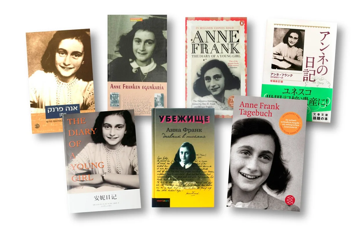
Over the years, the book cover design of Anne Frank’s diary has undergone several changes, reflecting the evolving understanding and perception of her story. The earliest editions of the diary featured a simple, understated design, often with a photograph of Anne herself. These covers aimed to introduce readers to the young girl behind the diary, emphasizing her humanity and relatability.
As time went on, the book cover designs became more symbolic, incorporating imagery and colors that evoke the themes explored in Anne’s writing. The designers began to experiment with different artistic styles, seeking to capture the essence of Anne’s spirit and the impact of her words on the world. Today, the most recognized book cover features a close-up of Anne’s face, her eyes filled with a mixture of innocence and wisdom, drawing readers into her world.
Analyzing the elements of the book cover: colors, typography, and imagery
The colors, typography, and imagery used in the book cover design of Anne Frank’s diary are not chosen at random. Each element serves a purpose in conveying the emotions and themes present in the diary.
The colors used in the book cover design are predominantly muted and somber, reflecting the seriousness of Anne’s story. Shades of gray, black, and white dominate the palette, symbolizing the darkness of the Holocaust and the struggle for survival. These colors also create a sense of timelessness, reminding readers that Anne’s story is not confined to a specific era but resonates with people across generations.
The typography used in the book cover design is often handwritten or in a script-like font, mimicking the style of Anne’s own writing. This choice not only pays homage to Anne’s personal writing style but also adds a sense of intimacy and authenticity to the cover. It creates a connection between the reader and the young girl whose words continue to inspire and educate.
The imagery on the book cover is carefully chosen to capture the essence of Anne’s spirit and the themes explored in her diary. The most iconic image is that of Anne’s face, her gaze penetrating the reader’s soul. The intensity in her eyes reflects the weight of her experiences and the resilience that allowed her to persevere. Other imagery often includes symbols of hope, such as a star or a candle, reminding readers that even in the darkest times, a glimmer of light can still be found.
The book cover design of Anne Frank’s diary successfully captures the spirit of the young girl who defied adversity and left an indelible mark on history. Through the use of symbolism and carefully chosen elements, the cover invites readers into Anne’s world, encouraging empathy, understanding, and a shared sense of humanity.
Anne’s spirit is portrayed through the combination of her image and the symbolism incorporated into the design. Her gaze, filled with both innocence and wisdom, captivates readers and draws them into her story. The colors, typography, and imagery further enhance the portrayal of her spirit, evoking emotions and sparking curiosity.
The book cover design invites readers to not only learn about Anne’s story but also to connect with her on a deeper level. It encourages reflection, empathy, and a renewed appreciation for the power of words to transcend time and touch the hearts of millions.


